Design Do’s & Don’ts
This page provides concise guidelines and best practices for designing accessible and inclusive web content. It highlights common design pitfalls to avoid (Don’ts) and offers practical recommendations for creating accessible designs (Do’s). By following these guidelines, designers can ensure that their websites are usable and enjoyable for all users, including those with disabilities.

Don’t:
Don’t rely on color alone to convey information or meaning.

Do:
Do ensure sufficient color contrast between text and background to improve readability for users with low vision or color blindness.
Don’t:
Don’t use images of text instead of actual text.

Do:
Do use live text whenever possible to ensure that it can be resized, translated, and read by screen readers for users with visual impairments.


Don’t:
Don’t use small or difficult-to-read typefaces.

Do:
Do use legible and easily readable typefaces with sufficient font size and line spacing to enhance readability for users with visual impairments.
Don’t:
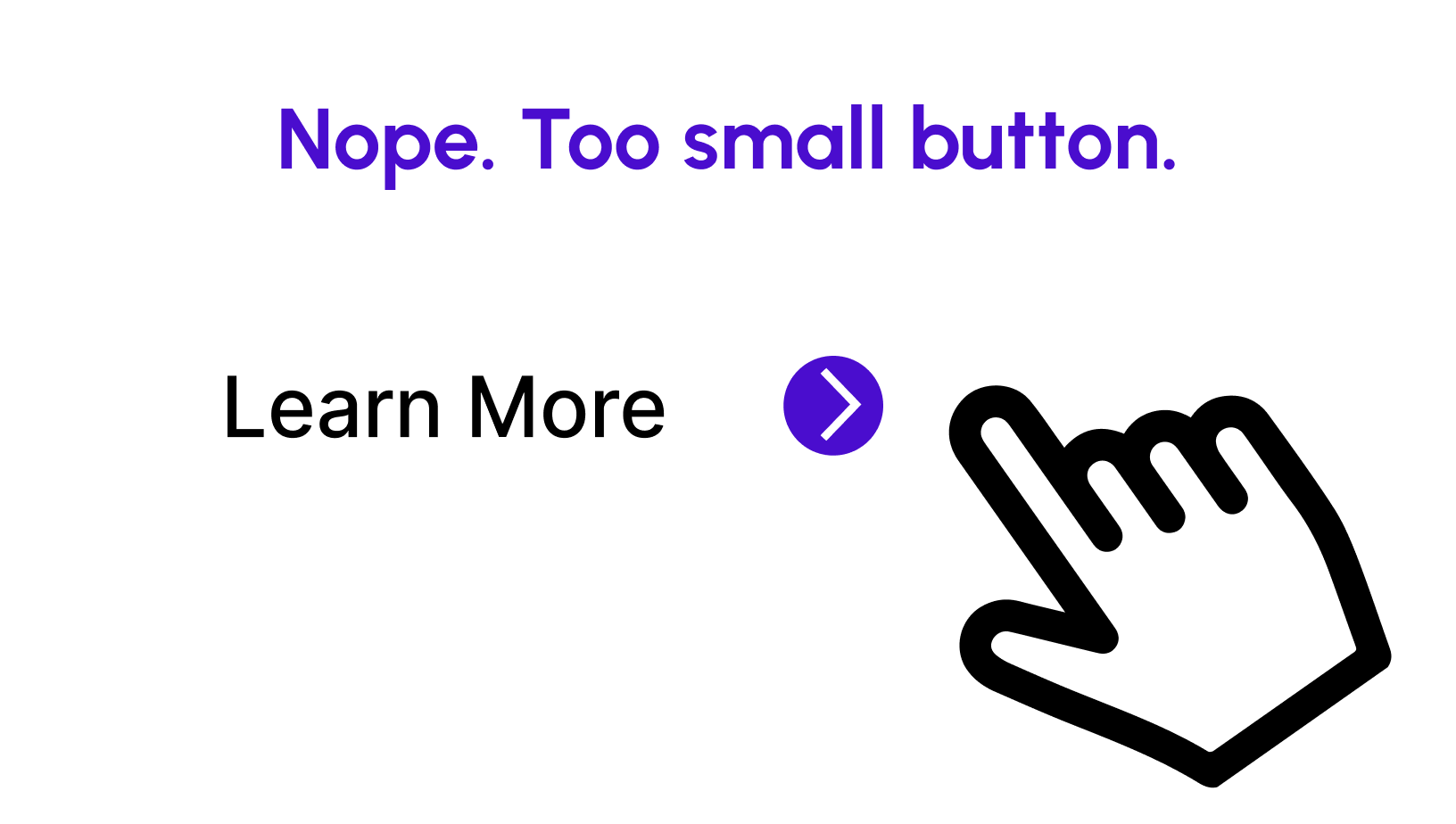
Don’t create content that requires precise mouse movements or gestures.

Do:
Do ensure that all interactive elements, such as buttons and links, are large enough and have enough spacing to be easily clickable or tappable, especially for users with mobility impairments.

